
 −14%
SHEIN ICON - Jupe mini moulante rétro
12 000 F
All Things You Want
BÉNÉFICES 1/ PROTÈGE LA PEAU DES RAYONS UV ET DES DOMMAGES CELLULAIRES PROFONDS La crème solaire fluide invisible sans parfum Anthelios UVMUNE 400 50+ comporte le nouveau filtre MEXORYL400 qui protège la peau des rayons UVA ultra-longs jusqu'à 400nm. 2/ PROTÈGE CONTRE LA POLLUTION ET LES INFRAROUGES Grâce à XL-PROTECT, une technologie de filtrage brevetée, la crème solaire fluide invisible sans parfum contribue à la protection contre les dommages causés par la pollution et les infrarouges. 3/ FORMULATION HAUTE TOLÉRANCE Cette crème solaire visage fluide invisible sans parfum est formulée avec des actifs dermatologiques de référence pour maximiser la tolérance sur les peaux réactives et sensibles au soleil. De ce fait, elle peut être appliquée sur la zone fine et fragile du contour de l'œil. RECOMMANDÉ POUR Problèmes ciblés : Photo-protection Dommages causés par le soleil Prévention des taches pigmentaires et des risques de photosensibilisation Type de peau : Convient aux peaux sensibles Sujettes aux intolérances solaires Âge : À partir de 12 ans /* * Used when device = desktop * Configured in: configuration/brazil-config/global/brand-story.cfg */ /* Because the carousel is implemented as an ol list, any lists in the card text will have a secondary list style (letters). This will give an incorrect appearance to viewers, so we set all lists to the primary list style (numbers). */ .aplus-brand-story-card ol li { list-style: decimal; } /* Top level containers */ .aplus-module .apm-brand-story-hero { -moz-box-sizing: border-box; -webkit-box-sizing: border-box; box-sizing: border-box; width: 1464px; height: 625px; background-color: #fff; } .aplus-module .apm-brand-story-card { -moz-box-sizing: border-box; -webkit-box-sizing: border-box; box-sizing: border-box; width: 362px; height: 453px; background-color: #fff; } .apm-brand-story-hero, .apm-brand-story-card { -moz-box-sizing: border-box; -webkit-box-sizing: border-box; box-sizing: border-box; position: relative; width: 100%; height: 100%; float: none; } .aplus-module.brand-story-card-1-four-asin .apm-brand-story-card { /* Only 12px to account for image cell border */ padding: 12px; } /* Full background image (Hero 1 & Card 2) */ .aplus-module .apm-brand-story-background-image { -moz-box-sizing: border-box; -webkit-box-sizing: border-box; box-sizing: border-box; overflow: hidden; position: absolute; width: 100%; height: 100%; } /* Card 1 small images */ .aplus-module .apm-brand-story-image-grid { -moz-box-sizing: border-box; -webkit-box-sizing: border-box; box-sizing: border-box; padding: 0px; margin: auto; display: flex; flex-flow: row wrap; } .aplus-module .apm-brand-story-image-grid .apm-brand-story-image-grid-item { /* Use content-box to ensure image size matches editor schema */ -moz-box-sizing: content-box; -webkit-box-sizing: content-box; box-sizing: content-box; padding: 0px; margin: 2px; width: 162px; height: 185px; border: 1px solid #fff; } .aplus-module .apm-brand-story-image-grid .apm-brand-story-image-grid-item .apm-brand-story-image-link { display: block; width: 100%; height: 100%; padding: 2px; } .aplus-module .apm-brand-story-image-grid .apm-brand-story-image-grid-item .apm-brand-story-image-link .apm-brand-story-image-img { display: block; width: 100%; height: 100%; object-fit: cover; } /* Card 3 logo image */ .aplus-module .apm-brand-story-logo-image { -moz-box-sizing: content-box; -webkit-box-sizing: content-box; box-sizing: content-box; height: 145px; margin: 0px 4px; padding: 20px; padding-bottom: 0px; } /* Text overlays */ .aplus-module .apm-brand-story-text-bottom { -moz-box-sizing: border-box; -webkit-box-sizing: border-box; box-sizing: border-box; position: absolute; bottom: 13px; left: 13px; } .aplus-module .apm-brand-story-hero .apm-brand-story-text-bottom { background-color: rgba(0,0,0,0.6); color: #fff; padding: 13px 65px 13px 13px; /* accounts for overlap of first card */ width: 437px; } .aplus-module.brand-story-card-2-media-asset .apm-brand-story-text-bottom { background-color: rgba(255,255,255,0.6); color: #000; padding: 13px; width: 336px; } .aplus-module.brand-story-card-1-four-asin .apm-brand-story-text { margin-top: 8px; padding-left: 2px; padding-right: 2px; } .aplus-module.brand-story-card-1-four-asin .apm-brand-story-text.apm-brand-story-text-single { margin-top: 20px; } .aplus-module.brand-story-card-1-four-asin .apm-brand-story-text h3 { white-space: nowrap; overflow: hidden; text-overflow: ellipsis; } .aplus-module .apm-brand-story-slogan-text { -moz-box-sizing: content-box; -webkit-box-sizing: content-box; box-sizing: content-box; margin: 0px 4px; padding: 20px; } .aplus-module .apm-brand-story-faq { -moz-box-sizing: content-box; -webkit-box-sizing: content-box; box-sizing: content-box; padding-top: 10px; } .aplus-module .apm-brand-story-faq-block { margin: 0px 10px; padding: 10px; } .aplus-v2 .apm-brand-story-carousel-container { position: relative; } .aplus-v2 .apm-brand-story-carousel-hero-container, .aplus-v2 .apm-brand-story-carousel-hero-container > div { position: absolute; width: 100%; } /* Ensuring the carousel takes only the space it needs. The sizes need to be set again on the absolutely positioned elements so they can take up space. */ .aplus-v2 .apm-brand-story-carousel-container, .aplus-v2 .apm-brand-story-carousel-hero-container { height: 625px; width: 100%; max-width: 1464px; margin-left: auto; margin-right: auto; overflow: hidden; } .aplus-v2 .apm-brand-story-carousel-hero-container, .aplus-v2 .apm-brand-story-carousel-hero-container > div { height: 625px; } .aplus-v2 .apm-brand-story-carousel.a-carousel-container { padding: 0px; } /* This centers the carousel vertically on top of the hero image container and after the logo area (125px). Margin-top = (heroHeight - cardHeight - logoAreaHeight) / 2 + logoAreaHeight */ .aplus-v2 .apm-brand-story-carousel .a-carousel-row-inner { margin-top: 149px; } /* Cards need to have a width set, otherwise they default to 50px or so. All cards must have the same width. The carousel will resize itself so all cards take the width of the largest card. The left margin is for leaving a space between each card. */ .aplus-v2 .apm-brand-story-carousel .a-carousel-card { width: 362px; margin-left: 30px !important; } /* styling the navigation buttons so they are taller, flush with the sides, and have a clean white background */ .aplus-v2 .apm-brand-story-carousel .a-carousel-col.a-carousel-left, .aplus-v2 .apm-brand-story-carousel .a-carousel-col.a-carousel-right { padding: 0px; } .aplus-v2 .apm-brand-story-carousel .a-carousel-col.a-carousel-left .a-button-image, .aplus-v2 .apm-brand-story-carousel .a-carousel-col.a-carousel-right .a-button-image { border: none; margin: 0px; } .aplus-v2 .apm-brand-story-carousel .a-carousel-col.a-carousel-left .a-button-image .a-button-inner, .aplus-v2 .apm-brand-story-carousel .a-carousel-col.a-carousel-right .a-button-image .a-button-inner { background: #fff; padding: 20px 6px; } .aplus-v2 .apm-brand-story-carousel .a-carousel-col.a-carousel-left .a-button-image .a-button-inner { border-radius: 0px 4px 4px 0px; } .aplus-v2 .apm-brand-story-carousel .a-carousel-col.a-carousel-right .a-button-image .a-button-inner { border-radius: 4px 0px 0px 4px; }
Aucun avis pour le moment.
Les avis viennent de clients qui ont reçu leur commande.
−14%SHEIN ICON - Jupe mini moulante rétro
12 000 F
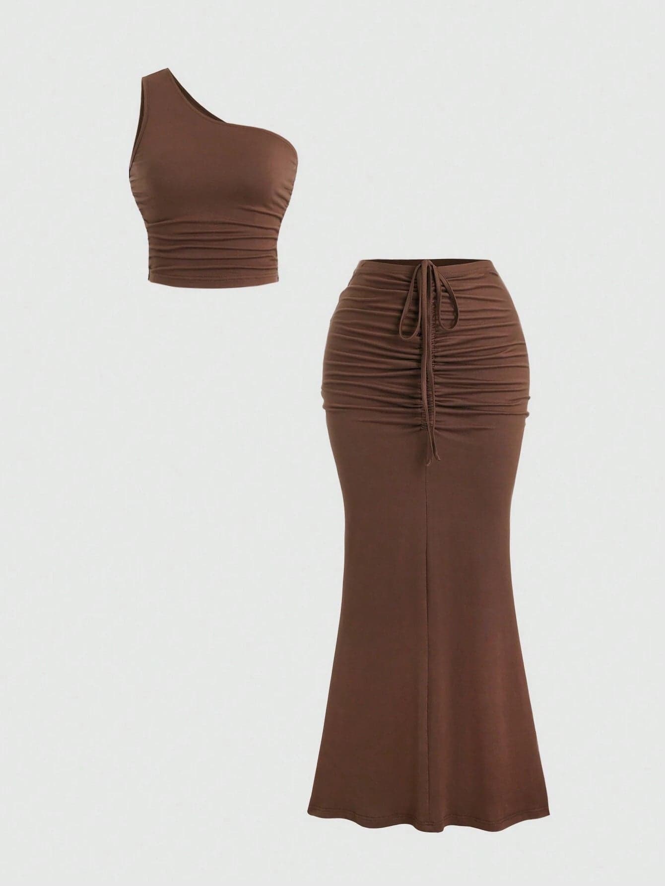
Ensemble Sweetra Y2K – Élégance décontractée pour l’été
14 000 F
 −15%
Robe trapèze en patchwork et maille
14 000 F
 −20%
Slaydiva – Robe Mini Volants Col V
9 900 F
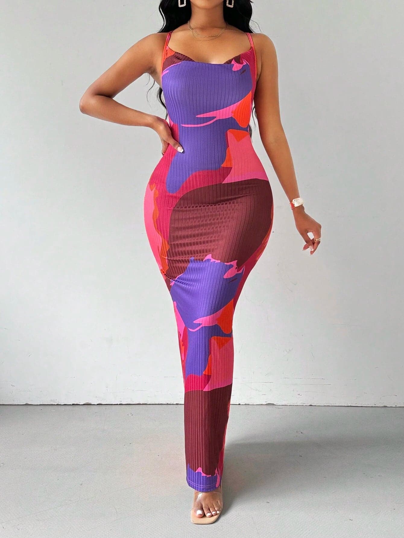
Robe Maxi Dos-Nu Tie-Dye
13 400 F
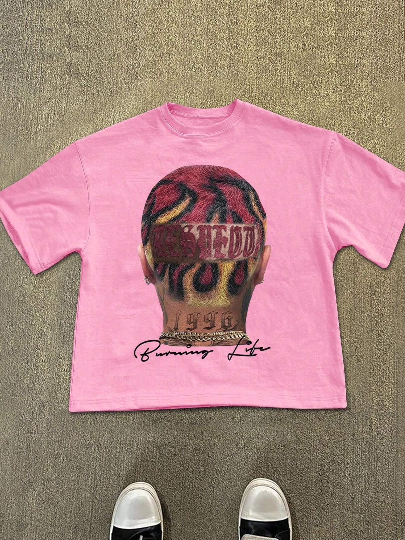
Manfinity EMRG – T-shirt casual à imprimé graphique
13 000 F
 Rupture
The Ordinary - Niacinamide 10% + Zinc 1%
10 000 F
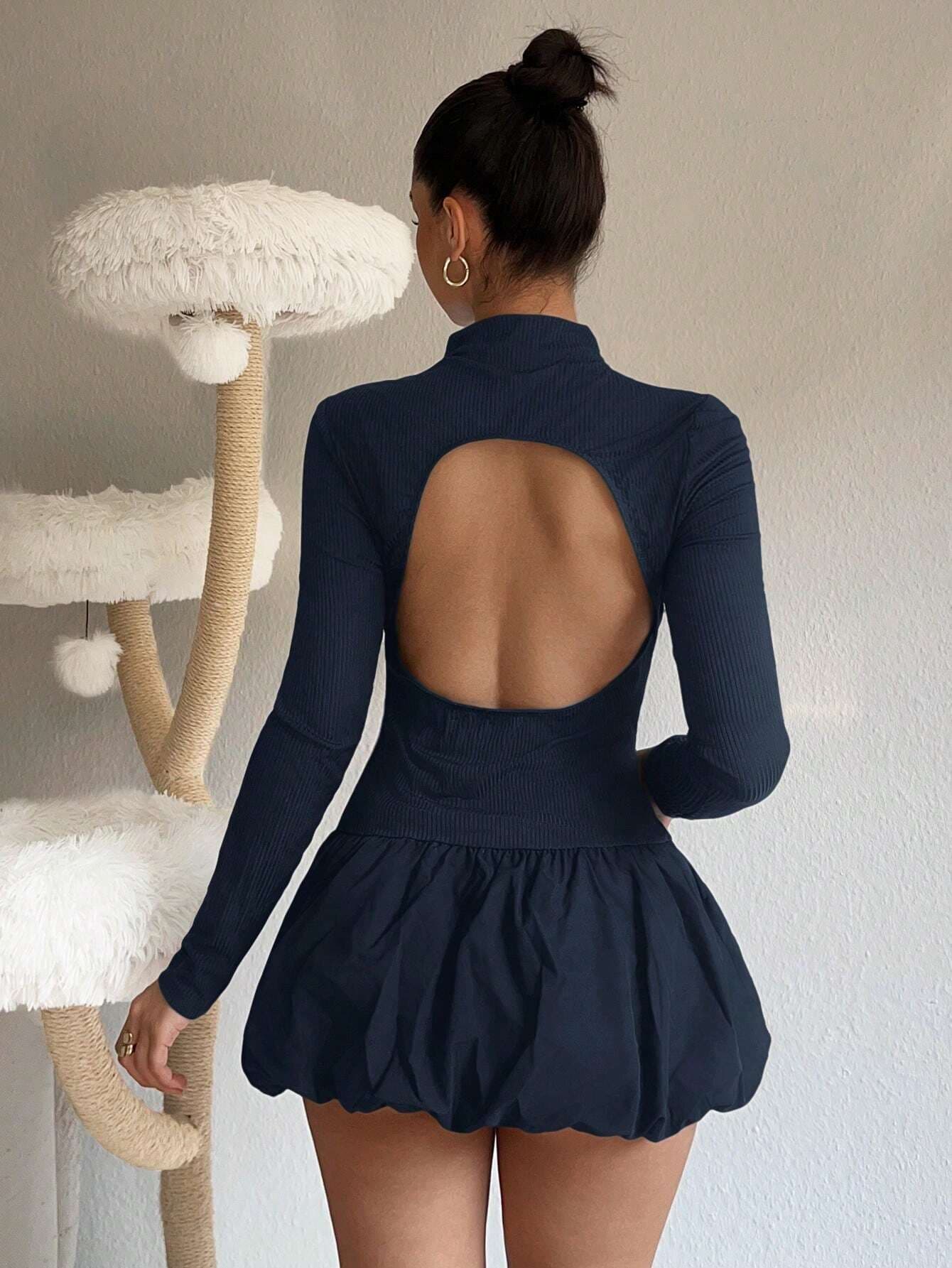
Robe mini à fleurs sans dos bleu marine
13 400 F
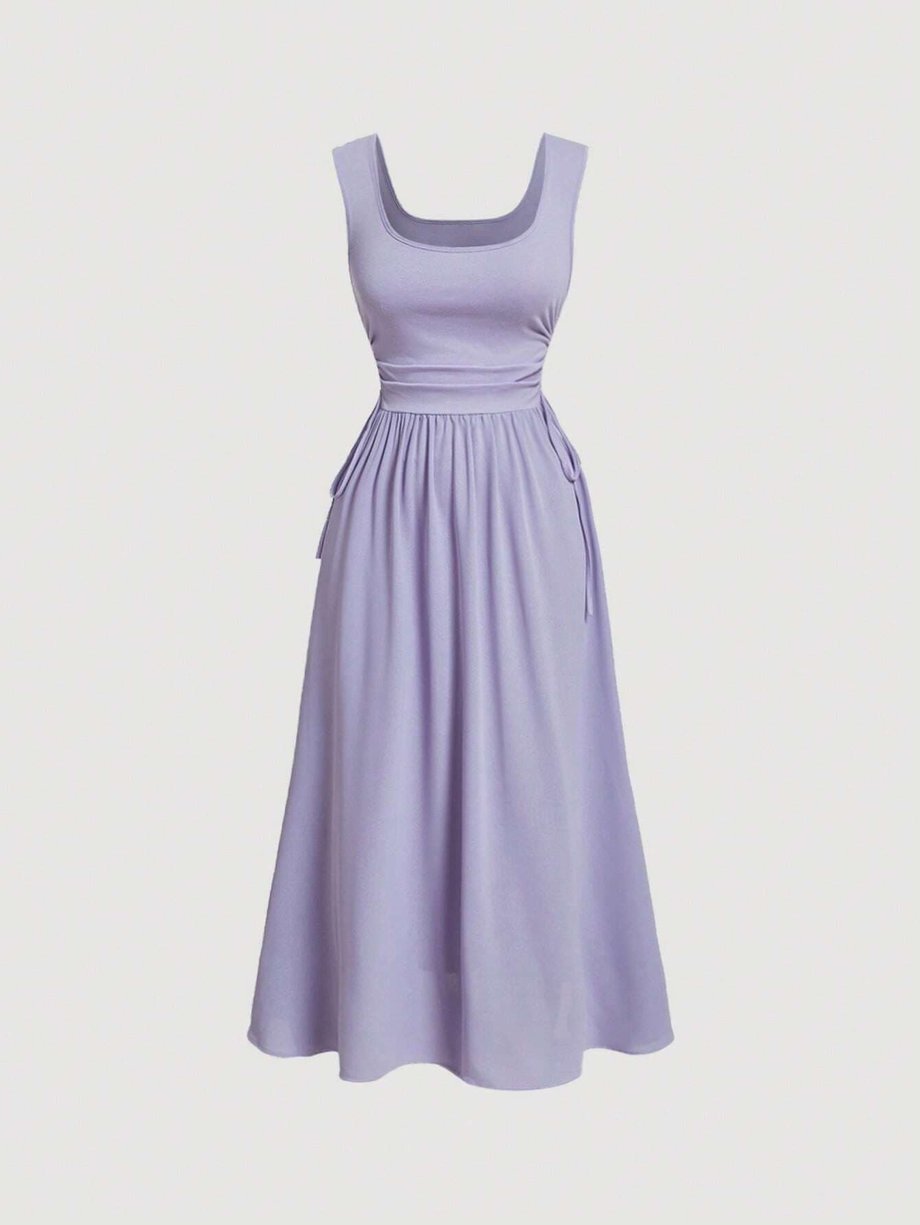
Robe Trapèze Lilas à Col Carré
14 400 F
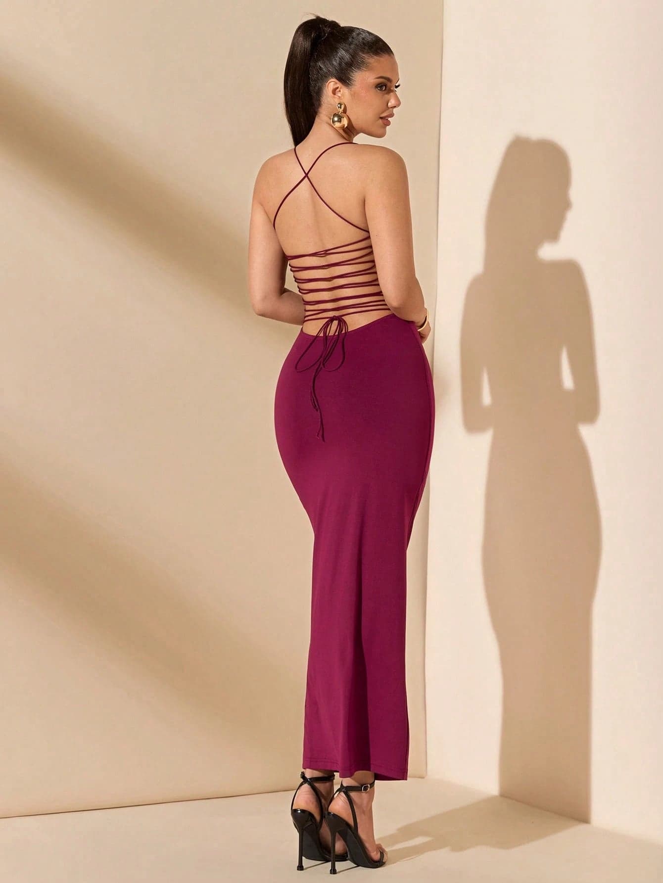
SHEIN BAE – Robe bordeaux dos-nu avec liens, élégance et séduction
14 000 F

La Roche-Posay — Anthelios UVMune 400 Crème Hydratante SPF50+
15 000 F
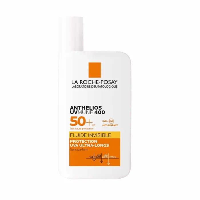
LA ROCHE POSAY - ANTHELIOS FLUIDE INVISIBLE UVMUNE 400 SPF50+ (SANS PARFUM)
16 000 F

Stick Solaire Zones Sensibles La Roche-Posay Anthelios SPF 50+ — 9 g
10 000 F

Spray Solaire Familial La Roche-Posay Anthelios SPF 50+ — 300 ml
27 000 F

Crème Solaire Hydratante La Roche-Posay Anthelios UVMune 400 SPF 50+ — 50 ml
15 000 F

Fluide Solaire Anti-Taches La Roche-Posay Anthelios UVMune 400 Melasyl SPF 50+ — Format Voyage 15 ml
5 500 F

Fluide Solaire Invisible La Roche-Posay Anthelios UVMune 400 SPF 50+ — Format Voyage 15 ml
5 500 F
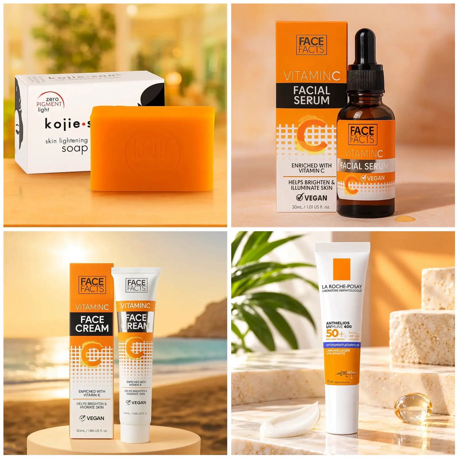
Pack N°58 — Routine Anti-Taches Visage — Savon Kojie San 135 g + Sérum Vitamine C 30 ml + Crème Vitamine C 50 ml + Fluide Solaire Anti-Taches La Roche-Posay SPF 50+ 15 ml
18 000 F